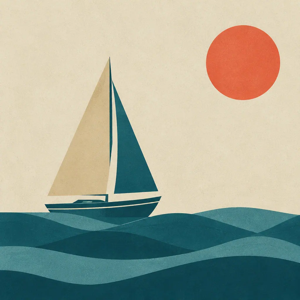
The distance between editorial illustration and clip art is mostly restraint. This prompt is built to enforce it.
What the prompt fixes
Limited palette is the most important instruction here, and it is why the palette is a variable rather than a vague adjective. Naming three specific colours produces a poster; asking for "a nice palette" produces six and a muddle.
Clean shapes and flat together keep the model away from gradients and soft shading, which is where vector illustration usually falls apart. The subtle paper grain is the one texture allowed back in — it is what stops the result looking like a UI asset.
The negative prompt is unusually blunt: gradients, photorealism, 3D render. Those are exactly the directions a model drifts when asked for something flat.
Changing it
{{subject}} should be a single recognisable object, not a scene. Flat illustration reads by silhouette, and silhouettes need one subject.
{{motif}} is the geometric field behind it — waves, arcs, concentric rings — and it carries the composition. Resist expanding {{palette}} past three colours; if the poster feels thin, change the colours rather than adding a fourth.
Flat Vector Poster
Geometric editorial illustration with a tight palette
A restrained flat-vector treatment. The tight palette is what makes it read as editorial rather than clip art, so resist adding a fourth colour.
Customize
Your prompt
177 charactersgradients, photorealism, 3d render, text, clutter